|
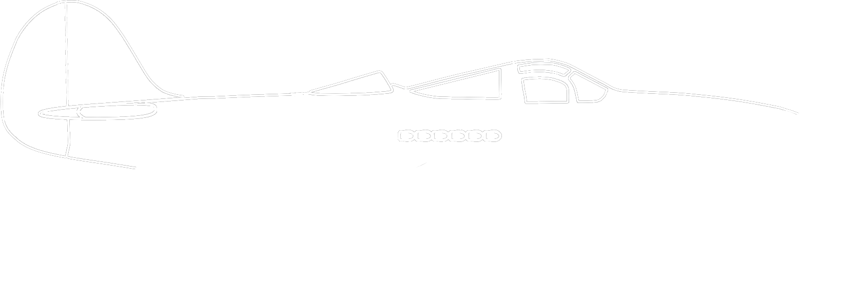
2015 I began my journey down the RC hobby rabbit hole in February of 2014, and you can read about my beginnings HERE. However, it wasn't until I released my nnP-39 in June of 2015 that I wanted to come up with a logo to define my brand. The P-39 was my most advanced design and to that point, the most visually appealing plane I had created. This design was also a BIG hit with the community and the looks just really stuck with me. Looking at my original design files (this one is dated August 17, 2015, 2:26:57 AM), I figure it took a few hours and about 10 variations to finalize my original logo. Given that I have no graphic design experience, I felt proud of what I created. 2016 - 2017 I used my original logo for just over a year. It wasn't until I started screen printing my own shirts and selling them that I realized it needed to be updated. The small lines of the plane outline and complex window pattern were hard to print on a shirt. So I thickened the plane lines and simplified the front window. There are still some shirts floating around with the original nerdnicRC logo, but not many. 2018 - Current In early 2018 I got the itch to make the nerdnicRC logo a little more, I don't know.. modern? I'm not sure what to call the new style, but it's further simplified and the P-39 lines are more bold.
0 Comments
Leave a Reply. |
© 2020 nerdnicRC


